Shango had a product in-market, but needed a facelift before shopping the application around for further funding and potential partnerships.
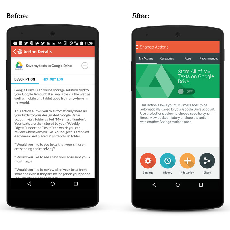
The initial product worked, but was confusing. Additional functionality had been scoped out, so the time was ripe to fix the existing interface. Fonts had a dated look and navigational structure wasn’t in-spec with recent trends. The color palette lacked focus…interactive elements weren’t easily identified.
Navigational hierarchies were defined and user flows were reconfigured to become more intuitive. Fonts were updated to reflect the more current UI trends. The color palette was refined and given purpose. Leading apps on the Google Play store were analyzed and best practices were gleaned where appropriate.