I was hired to think through aesthetics, animations and informational hierarchy.
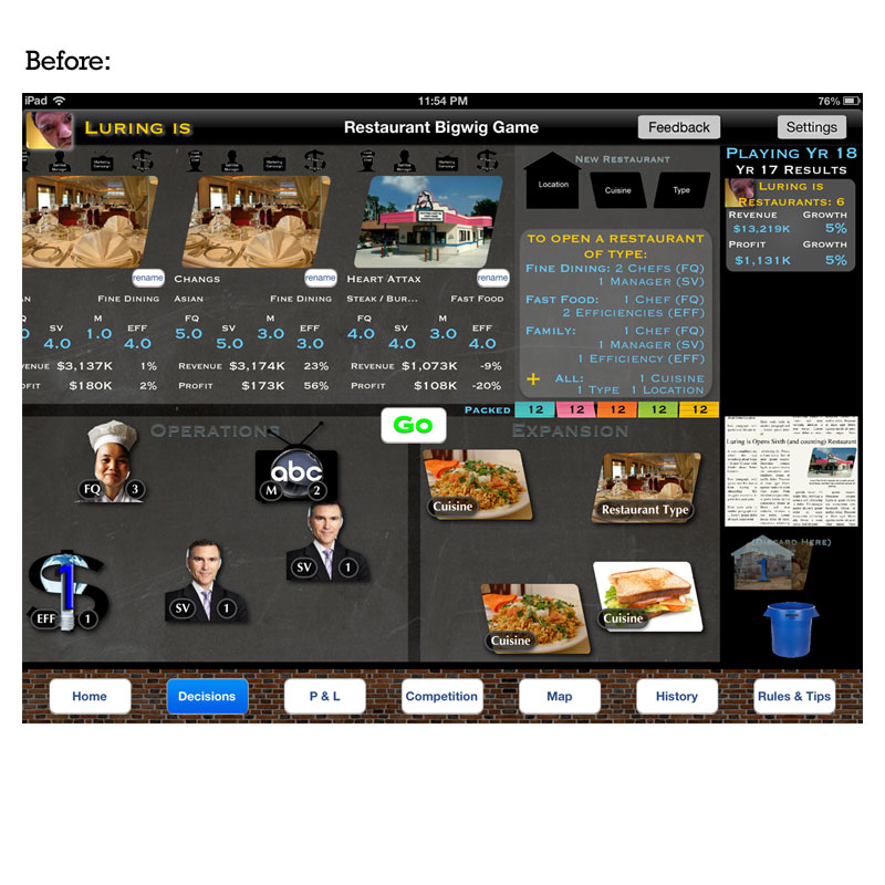
Bigwig Games had a challenge ahead of them; how do you make a game that is data-rich just as aesthetically-pleasing and intuitive as the top sellers in the iTunes Store? Initial concepts focused primarily on development, leaving UI/UX mostly untouched. After playing the game for a few hours and lengthy discussions with the founder and development team, we started to brainstorm ways to re-skin the bones that had already been built.
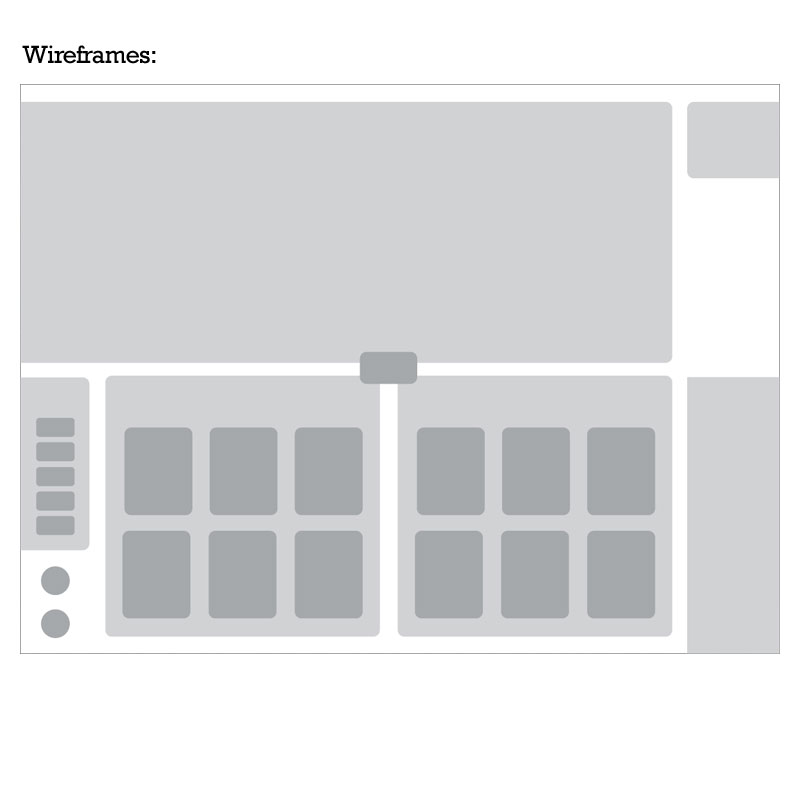
To visually communicate complex animations and new concepts without wasting precious cycles on creating production-ready art, we stuck to wireframing. Major “buckets” of content were broken out into modular sections, planning ahead for animations to come. Color hierarchies start to take shape, darkening and lightening certain elements to give them priority. Navigation is condensed into a singular button and seldom-used elements are removed completely.
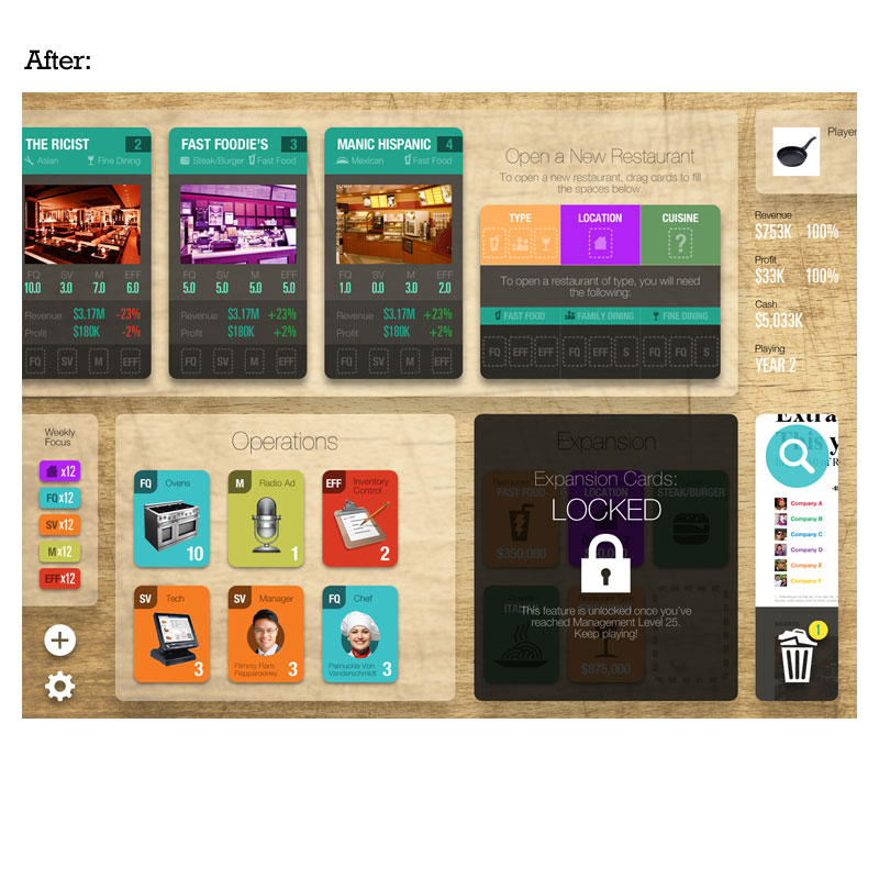
Color is applied to define conventions and quickly move the eye to important/interactive information. Font types, sizes, weights and colors are standardized for easy application across the platform. Standard iOS conventions and iconography are used strategically to lower the learning curve for new users. The data has become more organized and easily-digested and the overall aesthetic is more reflective of a board game.