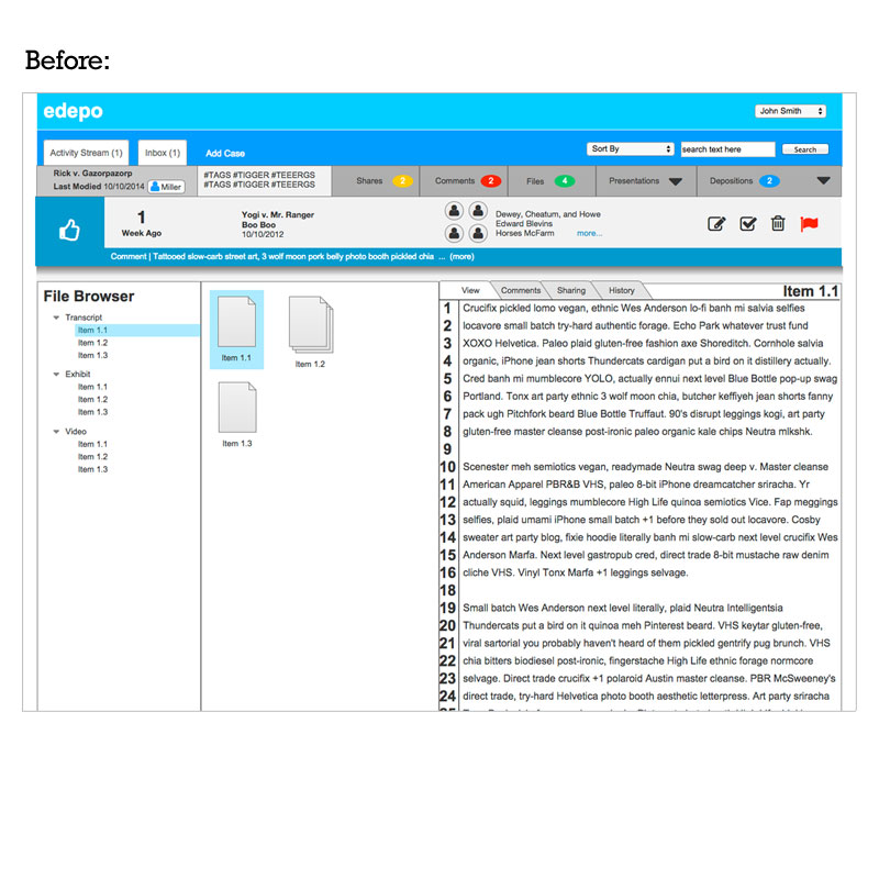
The company, specializing in electronic depositions, had a functional product in market, but needed help streamlining their user experience and updating their graphics.
Initially the user interface was hard to navigate. Customers found a way to make it work, but it was far from intuitive. After lengthy discussions with the founder, business development, customer service and tech teams, I was able to better grasp the core functionality of the product. Once that was verbalized, we dove deeper into the exercise by highlighting the most-used features, defining the hierarchy of information and discussing upcoming features so the application could easily accommodate new functionality.
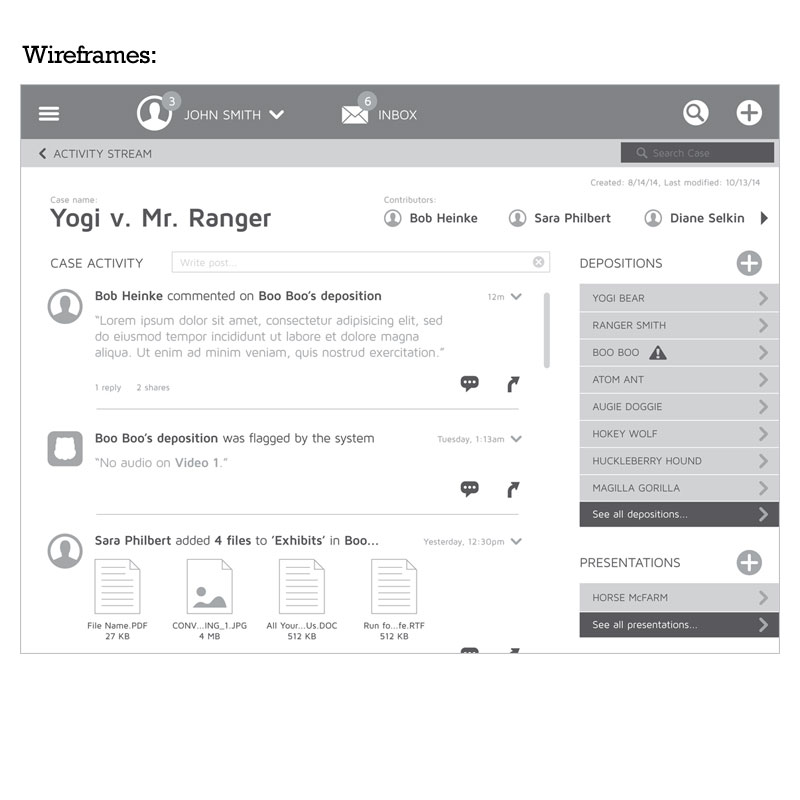
To visually communicate complex animations and new concepts without wasting precious cycles on creating production-ready art, we stuck to wireframing. The navigation was moved into a “drawer” that is accessed via a button in the top-left corner. A visual hierarchy was defined; the Activity Stream houses the Cases which contain Depositions, which are made up of individual files. An icon-driven approach was adopted to help easily designate file types and break up the text-heavy beta. Color is used more deliberately to help define similar content.
Color is applied to define conventions and quickly move the eye to important/interactive information. Font types, sizes, weights and colors are standardized for easy application across the platform. Standard iOS conventions and iconography are used strategically to lower the learning curve for new users. What was once an overwhelming, confusing presentation of information has become streamlined, with access to tiered content only being 2-3 taps away.